Chapter 02 · Section 2.1
The horizontal axis on the profit/loss diagram
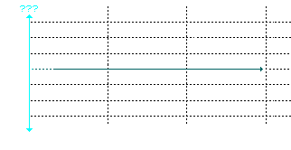 On the profit/loss diagram, the horizontal axis represents:
 a) the price of the underlying asset at the time the option is purchased.
No. The price of the underlying asset at the time the option is purchased is already certain when you have the position. So why represent it in a graph? b) the price of the underlying asset at time of expiration/exercise.
 c) time until expiration.
 d) the option premium.
 e) None of the above.
 (Click here for help)